One of the first steps when working with a fresh data set is to plot its values to identify patterns and outliers. When outliers appear, it is often useful to know which data point corresponds to them to check whether they are generated by data entry errors, data anomalies or other causes.
Unfortunately ggplot2 does not have an interactive mode to identify a point on a chart and one has to look for other solutions like GGobi (package rggobi) or iPlots.
However, if all is needed is to give a “name” to the outliers, it is possible to use ggplot labeling capabilities for the purpose. While labeling all points would usually produce a crowded and difficult to read plot, we can limit the labeling only to those points that respect certain conditions, namely our outliers.
Here is an example to illustrate this useful technique. We will be using the following data set consisting of 100 observations. The data set has been generated using rnorm for x and y. The label column provides an identifier for each observation in the form of “Data N” where N is the number of the observation.
To generate an outlier in the data set, the x value for observation number 87 has been changed to 100.
|
1 2 3 4 5 6 7 8 9 10 11 12 13 14 15 16 17 18 19 20 21 22 23 24 25 26 27 28 29 30 31 32 33 34 35 36 37 38 39 40 41 42 43 44 45 46 47 48 49 50 51 52 53 54 55 56 57 58 59 60 61 62 63 64 65 66 67 68 69 70 71 72 73 74 75 76 77 78 79 80 81 82 83 84 85 86 87 88 89 90 91 92 93 94 95 96 97 98 99 100 101 |
x y label 1 7 15 Data 1 2 14 16 Data 2 3 12 14 Data 3 4 14 10 Data 4 5 17 16 Data 5 6 8 12 Data 6 7 13 9 Data 7 8 12 4 Data 8 9 12 15 Data 9 10 10 8 Data 10 11 8 12 Data 11 12 7 15 Data 12 13 11 8 Data 13 14 17 9 Data 14 15 14 7 Data 15 16 10 18 Data 16 17 16 8 Data 17 18 15 6 Data 18 19 10 16 Data 19 20 13 16 Data 20 21 4 11 Data 21 22 15 11 Data 22 23 12 10 Data 23 24 12 12 Data 24 25 11 11 Data 25 26 10 7 Data 26 27 1 7 Data 27 28 12 9 Data 28 29 6 14 Data 29 30 12 19 Data 30 31 11 5 Data 31 32 3 15 Data 32 33 13 7 Data 33 34 8 15 Data 34 35 14 15 Data 35 36 0 18 Data 36 37 1 13 Data 37 38 –1 11 Data 38 39 12 9 Data 39 40 0 15 Data 40 41 12 16 Data 41 42 11 12 Data 42 43 8 5 Data 43 44 17 7 Data 44 45 11 12 Data 45 46 2 10 Data 46 47 17 7 Data 47 48 7 0 Data 48 49 11 5 Data 49 50 10 9 Data 50 51 4 11 Data 51 52 10 9 Data 52 53 18 9 Data 53 54 12 9 Data 54 55 6 14 Data 55 56 11 8 Data 56 57 12 9 Data 57 58 10 18 Data 58 59 7 19 Data 59 60 12 8 Data 60 61 5 14 Data 61 62 24 4 Data 62 63 13 4 Data 63 64 24 3 Data 64 65 14 8 Data 65 66 10 10 Data 66 67 8 15 Data 67 68 8 14 Data 68 69 9 11 Data 69 70 19 13 Data 70 71 12 9 Data 71 72 8 0 Data 72 73 5 16 Data 73 74 7 10 Data 74 75 14 –1 Data 75 76 14 7 Data 76 77 14 14 Data 77 78 16 14 Data 78 79 15 1 Data 79 80 7 8 Data 80 81 11 13 Data 81 82 9 17 Data 82 83 15 9 Data 83 84 6 13 Data 84 85 1 11 Data 85 86 6 1 Data 86 87 100 5 Data 87 88 13 15 Data 88 89 2 3 Data 89 90 10 7 Data 90 91 11 1 Data 91 92 5 7 Data 92 93 9 15 Data 93 94 18 8 Data 94 95 17 5 Data 95 96 4 7 Data 96 97 8 15 Data 97 98 8 11 Data 98 99 8 14 Data 99 100 5 13 Data 100 |
Let’s use qplot to plot the data.
|
1 |
qplot(data=data, x=x, y=y) |
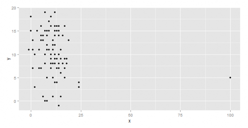
And here is the resulting plot.
The next step is to label the outlier (the point with x=100, observation number 87) and the outlier only with a label corresponding to its name. This is as easy as adding a geom_text call to qplot and setting the condition according to which the label has to be added.
|
1 2 |
qplot(data=data,x,y) + geom_text(aes(label=ifelse((x>4*IQR(x)|y>4*IQR(y)),label,“”)), hjust=1.1) |
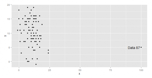
The call to geom_text as it appears above adds a label to all points, but only those for which either x is greater than four times the Inter Quartile Range of all x in data or y is greater than four times the IQR of all y in data receive a non empty label (equal to the corresponding name in the label column). All the other points, those that are not outliers according to the condition we have set, receive an empty label, which means no label is displayed for them.
The hjust parameter is used to slightly offset on the horizontal direction the label respect to the point, so it doesn’t overlap with it.
Here the graphical result, correctly identifying the outlier as being “Data 87”.
The right condition to specify within the ifelse statement to correctly select the outliers to label largely depends on the data set. Often it is a matter of trial and errors (trying 1.5 * IQR, 2 *IQR, 3 * IQR, …) until only the “right” outliers are labeled.
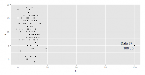
A small addition to the code above allows us to label the outliers also with their x and y values.
|
1 2 |
qplot(data=data,x,y) + geom_text(aes(label=ifelse((x>4*IQR(x)|y>4*IQR(y)),paste(label, “\n”, x, “,”, y),“”)), hjust=1.1) |
I hope you found this quick trick useful. If so, please let me know by leaving a comment below.
Till next time!


