In a previous series of posts, we had the chance to build a Really Minimal theme for WordPress 3.5 and higher. In case you missed those posts, you will find a link to them at the end of this article. I recommend you get yourself familiar with them before reading on.
As you recall, the theme we built was indeed minimal and it missed in particular any kind of styling. The recent release of Bootstrap 3.0 by Twitter gives us the chance to style our theme and, as a bonus, to turn it into a responsive design.
What is Bootstrap 3.0?
In its own words, Bootstrap 3.0 is a “Sleek, intuitive, and powerful mobile first front-end framework for faster and easier web development.” As such, it fits very well with WordPress! Bootstrap is all about creating functional and modern front-ends in a quick manner. Additionally, Bootstrap 3.0 is disigned around the mobile-first paradigm, which means the resulting site will be responsive and will display properly on any kind of portable device.
Getting Bootstrap 3.0
Bootstrap 3.0 can be downloaded from getbootstrap.com. Click on the large button that says DOWNLOAD BOOTSTRAP on the home page of the site.
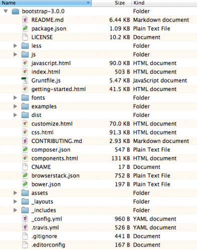
The downloaded ZIP file contains a lot of files and folders, including Bootstrap’s source code and documentation. What we need is the content of the directories js, css and fonts inside the dist directory.
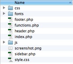
Duplicate your Really Minimal theme within wp-content/themes and rename its directory to really-bootstrap. Now copy the js, css and fonts folder from the Boostrap distribution inside the really-bootstrap theme folder. At this point the theme folder should look like this:
A small change to the header of the style.css file and we are ready to activate our new theme (which at this point is virtually identical to Really Minimal except for the name and the description).
|
1 2 3 4 5 6 |
/* Theme Name: Really Bootstrap Author: Marco Ghislanzoni Version: 1.0 Description: A really minimal Wordpress theme based on Bootstrap 3.0 */ |
Once you have edited style.css as above, open the WordPress dashboard, go to Appearance –> Themes and activate the new Really Bootstrap theme. We didn’t change screenshot.png, so the theme thumbnail will still say Really Minimal, but don’t worry, that is not fundamental for what follows.
Adding Bootstrap 3.0 support to the theme
Here is where we start to unleash the power of Bootstrap 3.0 to style our WordPress theme. Working with Bootstrap requires use to include in our site a reference to Bootstrap’s css and js files. The proper way to do it in WordPress is to use wp_enqueue_style and wp_enqueue_script from within functions.php. In particular, we need to create a new function that adds (or enqueues) the css style and the js script and then allow WordPress to call it at the right moment by adding a wp_enqueue_scripts action.
Open the functions.php file and add the following code after the registration of the sidebar:
|
1 2 3 4 5 6 7 8 9 |
/* Add bootstrap support to the Wordpress theme*/ function theme_add_bootstrap() { wp_enqueue_style( ‘bootstrap-css’, get_template_directory_uri() . ‘/css/bootstrap.min.css’ ); wp_enqueue_style( ‘style-css’, get_template_directory_uri() . ‘/style.css’ ); wp_enqueue_script( ‘bootstrap-js’, get_template_directory_uri() . ‘/js/bootstrap.min.js’, array(), ‘3.0.0’, true ); } add_action( ‘wp_enqueue_scripts’, ‘theme_add_bootstrap’ ); |
For both the css and the js we have referenced, for performance reasons, the minified versions (min). We could have referenced also the human readable versions by omitting the min. This is advisable during the development phase, when you may want to read through Bootstrap’s styles and javascript more easily to learn how they work and do some troubleshooting.
By default, wp_enqueue_style adds the css to the site’s head section, which is indeed what we want. In order to be ready to customize Bootstrap’s styles later on, we also enqueue our style.css after bootstrap.min.css.
When it comes to including bootstrap.min.js on the other hand, we need it to appear just before the closing of the body tag. This can be obtained by specifying the argument true inside the wp_enqueue_script function.
At this point our theme is almost ready to work with Bootstrap 3.0. We need just one more little step.
Open header.php and, just after the title tag, add the following meta line. This is necessary to make the mobile-first behavior of Bootstrap to work properly.
|
1 |
<meta name=“viewport” content=“width=device-width, initial-scale=1.0”> |
Ready to style a-la-Bootstrap!
Believe it or not, with these few changes our site can now be styled using Bootstrap 3.0! Actually, even without any further change, will already look like the standard Bootstrap.
Explaining in details how Bootstrap styling works is beyond the scope of this article, you can refer to the documentation on the getbootstrap.com site to learn the details. Here we will limit ourselves to using Bootstrap’s powerful responsive column system to style our site. We will then show how to customize a particular of the appearance through some custom css.
Let’s start by arranging the main content and the sidebar onto a responsive 12 columns system, with the main body taking 8 columns on the left and the sidebar taking 4 columns on the right. The site header, as well as the footer, will span all 12 columns.
First, let’s open header.php and add a div with class=”row” around the blog title and tagline (aka description). By default, the class “row” in Bootstrap makes the content span the entire range of columns in the grid (which is always a 12 columns one). Here is how the modified header.php looks like.
|
1 2 3 4 5 6 7 8 9 10 11 12 |
<DOCTYPE! html> <html> <head> <title></title> <meta name=“viewport” content=“width=device-width, initial-scale=1.0”> a <?php wp_head(); ?> </head> <body class=“container”> <div class=“row”> <h1><?php bloginfo( ‘name’ ); ?></h1> <p><?php bloginfo( ‘description’ ); ?></p> </div> |
You will also note that we have added a container class to the body tag. This is another Bootstrap feature that adds some nice padding around the content. If we don’t add it, there will be no padding on the left and on the right and the content of the site will reach the frame of the browser window.
Next, we need to do something similar for footer.php.
|
1 2 3 4 5 6 |
<div class=“row”> <p><?php bloginfo( ‘name’ ); ?> is proudly powered by Wordpress and Really Minimal.</p> <?php wp_footer(); ?> </div> </body> </html> |
We have added also in this case a div with the class=”row” around its content.
Last but not least, we need to define the grid columns for our content and side bar. Let’s open index.php and modify it as follows:
|
1 2 3 4 5 6 7 8 9 10 11 12 13 14 15 16 17 18 19 20 21 22 23 |
<?php get_header(); ?> <div class=“row”> <div class=“col-md-8”> <?php if (have_posts()) : while (have_posts()) : { the_post(); the_title(); echo( ‘<br />’ ); the_content(); echo( ‘<br />’ ); } endwhile; endif; ?> </div> <div class=“col-md-4”> <?php get_sidebar(); ?> </div> </div> <?php get_footer(); ?> |
We have added another div with class=”row” around the whole content and side bar. This tells Bootstrap that they should be placed inside the same row within the grid. We have also moved the code to generate the sidebar just before get_footer as we want the sidebar to float to the right of the content.
Then we have wrapped the dynamically generated content within a div with class=”col-md-8″ and the dynamically generated sidebar in a div with class=”col-md-4″. This makes the content span 8 columns of the grid and the sidebar span 4 columns, for a total of 12.
This is it, well done! Now save everything and have a test drive of your new WordPress site powered by Bootstrap 3.0! Try to shrink the horizontal size of the browser window to see the responsive behavior. Below a certain width the side bar will move automatically below the content. Cool, isn’t it?
The whole site has also the typical flat look of Bootstrap 3.0, but it doesn’t have to be so. In the next step we will see how to add custom styles to it.
A final touch: custom styles with Bootstrap
Now that our theme is powered by Bootstrap, how do we style it further? The answer lies within the cascading property of css style sheets. We have already included our style.css, even though at the moment is totally empty (except for its header).
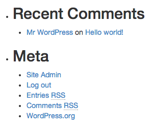
Let’s suppose we want to remove the annoying bullet from the widget titles.
Using Firebug or another inspector we recognize that the bullet style comes from the class “widget”. To remove it, let’s open our style.css and add to it the following code:
|
1 2 3 |
.widget { list-style-type: none; } |
Save, reload et voila’! The bullet is gone.
Exactly in the same way we can override any of the default aspects of Bootstrap or WordPress themes. Just identify the class corresponding to what you want to modify and add an override for it to style.css.
Well, I hope you have enjoyed this article. If so, please let me know by leaving a comment below. I am thinking to write other posts covering, for example, how to add Bootstrap navigation bars and more to our WordPress theme.
Till next time!
Previous posts: A Really Minimal Theme for WordPress 3.5+


24 responses to “Adding Bootstrap 3.0 support to your WordPress theme”
[…] designing your theme from scratch, Marco Ghislanzoni has put together a very clear guide to adding Bootstrap 3.0 support to your theme. Alternatively, if you’re creating your own theme, then there are several Bootstrap skeleton […]
Nice tutorial. Bootstrap has a lot of built in solutions for styling and nice js scripts as well. You can really create a really nice looking site in a matter of minutes. The only problem is integrating it into a CMS and this explains it well. Thank you.
Hi Manuel, you are welcome! Glad that this tutorial helped you with your site. Cheers, Marco.
What about jQuery? Doesn’t bootstrap.min.js depend on the presence of jQuery?
Hi Reuben,
Bootstrap per se does not depend on jQuery, however its Javascript plugins do, so had we used any JS plugin we would have had to include jQuery as well. In the case of this tutorial however we are using only the CSS related part of Bootstrap, so including jQuery is unnecessary.
Cheers,
Marco.
wp_enqueue_script( 'bootstrap-js', get_template_directory_uri() . '/js/bootstrap.min.js', array('jquery'), '3.0.0', true );Using this version of the Bootstrap JS inclusion should handle your jQuery issue. See the section on this page entitled “Link a Theme Script Which Depends on jQuery”.
Great Tutorial. I’d like to read about how to add menu bar in the near future, please. Thank you
Nice post dude.
You are welcome dude!
Excellent walkthrough, great work!
I wanted to know how I need will alter the steps if I want to integrate Boostrap into a child theme please.
Could you help please?
I think I need to add CSS / JS / Fonts folders to my Canvas Child folder.
Then I need to add the enqueue code to the functions.php file of my Child Theme.
Then I need to create a header.php and add the view port meta code.
Please confirm if these are indeed the correct steps.
Cheers,
Linz
Hi Linz,
provided your parent theme supports child themes, the process is the same. Just remember that everything in a child theme overrides the corresponding element in the parent theme EXCEPT for functions.php. The child theme functions.php is loaded before the parent theme version and in addition to it. More references here: http://codex.wordpress.org/Child_Themes
I would suggest you try it out and see whether it works.
Cheers,
Marco.
I don’t usually write on this blogs, but this time it was really useful since I’ve been trying to add bootstrap to my wordpress theme so many time…
Thanks!!
You are welcome Monica, glad it provided useful to you.
Ciao,
Marco.
Hi, this is the bootstrap tutorial I was looking for ! Just a tip : to remove the bullet on the sidebar list I needed to type “.widget li” .
its realy help for customizing my home page….
nice article…thnks
Tc..
Great post. Thanks a lot!
[…] Adding Bootstrap 3.0 support to your WordPress theme […]
Güzel bir makale teşekkürlerimi sunarım
Ok, I had to use Google translate on this one… You are welcome! 🙂
Cheers,
Marco.
Awesome man……lot of thanks
You are welcome!
thanks for share info
You are welcome! 🙂
Great article. I was looking for the tutorials to add bootstrap to the WordPress theme for my new project. Thanks alot for solving my problem.