In Part 3 of this series we will explore some more variations to our Sales Dashboard in R and introduce new ways of visualizing sales related data with qplot and ggplot2. If you haven’t done it yet, it is recommended to read Part 1 and Part 2 first.
1. Dodging (with care!)
The last bar chart we created in Part 2 could be further improved to allow a year by year comparison of the orders each sales person brought in. Visually we could show the orders from each year side-by-side for each sales person. Once again, this is fairly easy to do with qplot. It only takes one additional parameter.
|
1 |
qplot(x=Salesperson, y=Order.Amount, fill=as.character(Order.Date, “%Y”), geom=“bar”, stat=“identity”, position=“dodge”, data=data, xlab=“Sales Person”, ylab=“Order Amount (USD)”, main=“Orders by Sales Person and Year”) + theme(axis.text.x = element_text(angle=90, hjust=1, vjust=0)) + guides(fill=guide_legend(title=“Year”, reverse=TRUE)) |
In ggplot2 jargon, switching from stacked bars (the default) to side-by-side bars is called dodging. This is obtained with the parameter position=dodge in the call to qplot.

This looks great, except that is WRONG! Not easy to recognize, but once we dodge the bars qplot stops stacking them within each year and reverts to simply overlapping them. There is indeed a limitation in the current implementation of ggplot2 where it is not possible to stack according to one variable and dodge according to another one at the same time.
In order to check that within each year we indeed have a number of overlapped bars instead of stacked ones, let’s redraw the previous chart by adding an alpha parameter. The alpha parameter makes the bar semi-transparent and when they overlap the color adds up until it becomes solid. The value of alpha says how many overlapping level there should be until the color becomes solid.
|
1 |
qplot(x=Salesperson, y=Order.Amount, fill=as.character(Order.Date, “%Y”), geom=“bar”, stat=“identity”, position=“dodge”, alpha=I(1/5), data=data, xlab=“Sales Person”, ylab=“Order Amount (USD)”, main=“Orders by Sales Person and Year”) + theme(axis.text.x = element_text(angle=90, hjust=1, vjust=0)) + guides(fill=guide_legend(title=“Year”, reverse=FALSE)) |
With alpha=I(1/5) we tell qplot that the color should become solid when 5 levels are stacked. Here is the resulting chart.

You will not that within each year there are multiple bars overlapping. So only the orders with the maximum value within each year/sales person combination are the only visible one in the original chart above. To check it, let’s summarize the data to calculate the maximum Order.Amount for each year / sales person combination. For the purpose, we can use melt and cast to create a Pivot Table as explained in a previous post or we can use an alternative method based on the aggregate() function. Let’s follow the latter route to practice with something new.
|
1 2 3 4 5 6 7 8 9 10 11 12 13 14 15 16 17 18 19 20 21 22 23 24 25 26 27 28 29 |
aggregate(Order.Amount ~ Salesperson + as.character(Order.Date, “%Y”), data=data, max) Salesperson as.character(Order.Date, “%Y”) Order.Amount 1 Buchanan 2003 9210.90 2 Callahan 2003 3741.30 3 Davolio 2003 5398.72 4 Dodsworth 2003 5275.71 5 Fuller 2003 3354.00 6 King 2003 8593.28 7 Leverling 2003 2222.40 8 Peacock 2003 7390.20 9 Suyama 2003 2645.00 10 Buchanan 2004 6475.40 11 Callahan 2004 4825.00 12 Davolio 2004 6635.27 13 Dodsworth 2004 4960.90 14 Fuller 2004 10164.80 15 King 2004 9194.56 16 Leverling 2004 10495.60 17 Peacock 2004 11188.40 18 Suyama 2004 4707.54 19 Buchanan 2005 4581.00 20 Callahan 2005 4813.50 21 Davolio 2005 15810.00 22 Dodsworth 2005 11380.00 23 Fuller 2005 16387.50 24 King 2005 12615.05 25 Leverling 2005 10952.84 26 Peacock 2005 8446.45 27 Suyama 2005 2393.50 |
This are indeed the values that are plotted in the WRONG chart above.
2. Dodging the right way
What we need to do in order to obtain the correct chart, where summing up the bars for each year’s orders for the same sales person leads to the correct totals, is to summarize the data as needed in a new data frame. We can use aggregate() or melt and cast for the purpose. Let’s stick to using aggregate().
|
1 2 3 4 5 6 7 8 9 10 11 12 13 14 15 16 17 18 19 20 21 22 23 24 25 26 27 28 29 30 |
data.sum <– aggregate(Order.Amount ~ Salesperson + as.character(Order.Date, “%Y”), data=data, sum) > data.sum Salesperson as.character(Order.Date, “%Y”) Order.Amount 1 Buchanan 2003 17667.20 2 Callahan 2003 19160.70 3 Davolio 2003 30861.76 4 Dodsworth 2003 9894.51 5 Fuller 2003 17811.46 6 King 2003 15232.16 7 Leverling 2003 18223.96 8 Peacock 2003 49945.11 9 Suyama 2003 14519.68 10 Buchanan 2004 31433.16 11 Callahan 2004 56954.02 12 Davolio 2004 95850.36 13 Dodsworth 2004 24756.89 14 Fuller 2004 71168.14 15 King 2004 59827.19 16 Leverling 2004 103719.07 17 Peacock 2004 124655.56 18 Suyama 2004 40826.37 19 Buchanan 2005 19691.89 20 Callahan 2005 46917.95 21 Davolio 2005 55787.97 22 Dodsworth 2005 40396.64 23 Fuller 2005 73524.18 24 King 2005 41903.64 25 Leverling 2005 79253.24 26 Peacock 2005 51163.01 27 Suyama 2005 17181.58 |
aggregate() works by using the specified aggregation function (sum in this case) to aggregate Order.Amount by Salesperson and Year. The ~ symbol in the formula can be read as “by”, while data specifies the source data frame for the variables. The “+” between the two aggregation factors indicates we want to use both. In this case, it will sum all order amounts for each sales person and year combination, which is exactly what we want.
These are the right totals to chart. For an easier handling, let’s modify the name of the second column in the data frame we just obtained.
|
1 2 3 4 5 6 |
names(data.sum)[2] <– “Order.Year” str(data.sum) ‘data.frame’: 27 obs. of 3 variables: $ Salesperson : Factor w/ 9 levels “Buchanan”,“Callahan”,..: 1 2 3 4 5 6 7 8 9 1 ... $ Order.Year : chr “2003” “2003” “2003” “2003” ... $ Order.Amount: num 17667 19161 30862 9895 17811 ... |
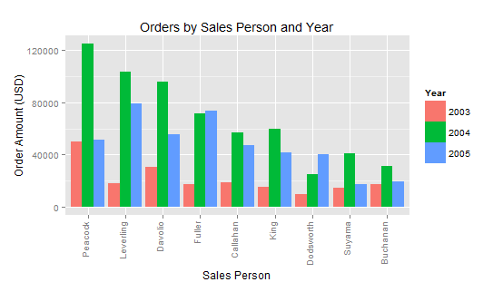
Ok, we are ready to plot our correct dodged bar chart using the new data frame we just created.
|
1 |
qplot(x=Salesperson, y=Order.Amount, fill=Order.Year, geom=“bar”, stat=“identity”, position=“dodge”, data=data.sum, xlab=“Sales Person”, ylab=“Order Amount (USD)”, main=“Orders by Sales Person and Year”) + theme(axis.text.x = element_text(angle=90, hjust=1, vjust=0)) + guides(fill=guide_legend(title=“Year”, reverse=FALSE)) |

Note that beside setting data=data.sum and changing fill=Order.Year, we have also set reverse=FALSE to better match the orders of the years in the legend (guide) with the left to right order in the chart.
Now that we have a correct chart, let’s move on with an additional improvement.
3. Sorting by total Order Amount
We have obtained indeed a nice and easy to read chart, but as it is right now it doesn’t make it easy to evaluate who our top sales people are. We could revert to the stacked format or we could think of sorting the Sales Person axis, which currently is arranged in alphabetical order, by total Order Amount instead.
In order to understand how to do it, let’s look once more at the structure of our data (this was covered extensively in Part 1).
|
1 2 3 4 5 |
str(data.sum) ‘data.frame’: 27 obs. of 3 variables: $ Salesperson : Factor w/ 9 levels “Buchanan”,“Callahan”,..: 1 2 3 4 5 6 7 8 9 1 ... $ Order.Year : chr “2003” “2003” “2003” “2003” ... $ Order.Amount: num 17667 19161 30862 9895 17811 ... |
We can note that Salesperson is a Factor. In particular, it is an unordered Factor. We can test this with a call to is.ordered().
|
1 2 |
is.ordered(data.sum$Salesperson) [1] FALSE |
When dealing with unordered factors that are character based, by default qplot (and ggplot2 in general) will revert to the standard ordering which is the alphabetical one. This is why our sales people are listed in alphabetical order in the bar chart.
We can change this be reordering the Salesperson factor according to the sum of the orders for each sales person. This can be easily achieved with the reorder() function or by creating a new factor with factor(). Let’s use the latter method.
First, we need to calculate the total order amount for each sales person. This can be done with a new call to aggregate().
|
1 2 3 4 5 6 7 8 9 10 11 12 |
Total.Order <– aggregate(Order.Amount ~ Salesperson, data=data.sum, sum) > Total.Order Salesperson Order.Amount 1 Buchanan 68792.25 2 Callahan 123032.67 3 Davolio 182500.09 4 Dodsworth 75048.04 5 Fuller 162503.78 6 King 116962.99 7 Leverling 201196.27 8 Peacock 225763.68 9 Suyama 72527.63 |
Next we need to sort Total.Order by Order.Amount (which is the total order amount). For the task we can use the order function within the index of Total.Order. Here is how to achieve it.
|
1 2 3 4 5 6 7 8 9 10 11 12 |
Total.Order <– Total.Order[ order(Total.Order$Order.Amount, decreasing=TRUE), ] > Total.Order Salesperson Order.Amount 8 Peacock 225763.68 7 Leverling 201196.27 3 Davolio 182500.09 5 Fuller 162503.78 2 Callahan 123032.67 6 King 116962.99 4 Dodsworth 75048.04 9 Suyama 72527.63 1 Buchanan 68792.25 |
We have specified decreasing=TRUE because we want to order our sales person from the highest to the lowest total order.
The last step is to use this sequence to order the Salesperson factor. For that, we basically re-create the factor with the new ordering sequence.
|
1 |
data.sum$Salesperson <– factor(as.character(data.sum$Salesperson), levels=Total.Order$Salesperson, ordered=TRUE) |
With this done, let’s test the levels now.
|
1 2 3 4 5 6 7 8 9 10 |
levels(data.sum$Salesperson) [1] “Peacock” “Leverling” “Davolio” “Fuller” “Callahan” “King” [7] “Dodsworth” “Suyama” “Buchanan” > is.ordered(data$Salesperson) [1] TRUE str(data.sum) ‘data.frame’: 27 obs. of 3 variables: $ Salesperson : Ord.factor w/ 9 levels “Peacock”<“Leverling”<..: 9 5 3 7 4 6 2 1 8 9 ... $ Order.Year : chr “2003” “2003” “2003” “2003” ... $ Order.Amount: num 17667 19161 30862 9895 17811 ... |
Ok, we are ready to plot our data again using the new ordering of the Salesperson factor. The command is the same as for the last chart we created above, however the output will now be sorted by decreasing total amount of order per sales person.
|
1 |
qplot(x=Salesperson, y=Order.Amount, fill=Order.Year, geom=“bar”, stat=“identity”, position=“dodge”, data=data.sum, xlab=“Sales Person”, ylab=“Order Amount (USD)”, main=“Orders by Sales Person and Year”) + theme(axis.text.x = element_text(angle=90, hjust=1, vjust=0)) + guides(fill=guide_legend(title=“Year”, reverse=FALSE)) |
So Peacock has indeed been our best sales person over the 3 years and she deserves the first position in our chart!
This concludes Part 3. In Part 4 we will cover other ways to slice and dice our sales data. Till next time!