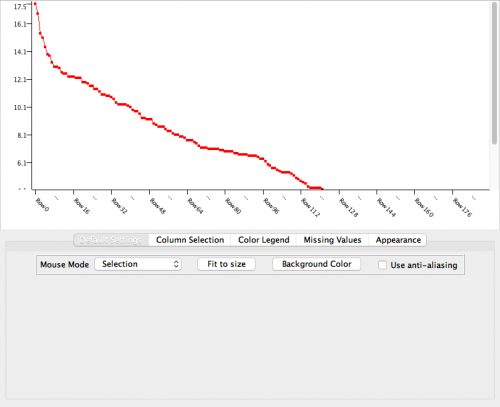
KNIME is great for all data manipulation and analysis tasks, but so far it hasn’t shined in the visualization compartment. The native chart nodes produce an output which, despite being interactive and supporting highlighting, is everything but visually appealing. In full honesty it has a bit of 1990’s look and feel.
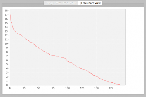
Using JFreeChart or an R View node with ggplot2 is a viable and better looking alternative, even though their interactivity is very limited and the interaction dynamic far from ideal.
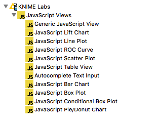
There are however additional possibilities. Recently KNIME has introduced few JavaScript View nodes (available as extension from KNIME Labs) which surely represent a step forward. On the down side they support only very basic chart types. For example, there is no Bubble Chart node, let alone some of those fancy visualizations which are often part of modern dashboards.
Among the JavaScript Views node there is a Generic JavaScript View one. In theory this node could be used to create any JavaScript based visualization of a data table passed to it. In practice, out of the box, it seems to support only D3.js. While D3.js is per se great, it’s a bit too low level and cumbersome to use for my taste.
I am more for something like R’s ggplot2, which provides a high level of flexibility yet has an elegant and easy to read syntax. Enter Plotly.js.
Plotly.js is so much more user friendly than D3.js and it can produce high quality stunning looking interactive plots in a breeze. It can also produce all the fancy visualizations you can think of. Check it out here.
Wouldn’t it be great if we could use all the power of Plotly.js inside KNIME? Well, after many tries I finally managed to make it work! Below is a comprehensive step-by-step description on how to do it… You are welcome! 🙂
STEP 1
We are going to use a Generic JavaScript View node to load, activate, configure and plot with Plotly.js. This node is part of the JavaScript Views extension available from KNIME Labs. Go to File –> Install KNIME Extensions… then search for “JavaScript Views”. Downlaod and install them to prepare for the next step.
STEP 2
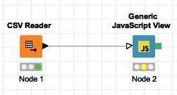
Add a Generic JavaScript View node to your workflow. Connect its input to the output of the node producing the data table to be plotted. Depending how the organization of your data table, the javascript code we are about to enter in the configuration dialog of the Generic JavaScript View node may require some adjustment in the part that retrieves from the input table the data to plot.
STEP 3
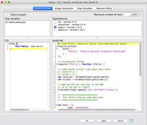
Open the configuration window of the Generic JavaScript View node and do following:
In the Dependencies box, check jQuery. This is all we need when it comes to dependencies. While Plotly.js is built on top of D3.js, D3 doesn’t need to be checked since it will be imported directly by Plotly.js itself.
In the CSS code box, enter what you need to style your page. For a simple unstyled body, you can limit it to:
|
1 2 3 |
body { font-family: sans-serif; } |
or simply leave it empty. So far nothing special, isn’t it?
STEP 4
Here comes the juicy part. The JavaScript code box holds the code that will be executed when the view is displayed. This code needs to execute four main tasks.
a) Dynamically load the Plotly.js library and initialize it.
b) Retrieve the data to be plotted from the input to the node.
c) Make the DOM (Document Object Model) ready for plotting the chart.
d) Call Plotly to plot the chart.
The final step d) may be simple or very complex, depending on how rich and fancy your chart is going to be. The previous three steps remain mostly the same and require minimal adjustments.
To produce a fancy choroplet map plot out of this sample dataset this is the code you need to enter in the JavaScript box:
|
1 2 3 4 5 6 7 8 9 10 11 12 13 14 15 16 17 18 19 20 21 22 23 24 25 26 27 28 29 30 31 32 33 34 35 36 37 38 39 40 41 42 43 44 45 46 47 48 49 50 51 |
// Load Plotly – Requires jQuery (tick in Dependencies above) require.config({ paths: { ‘Plotly’: ‘https://cdn.plot.ly/plotly-latest.min’ } }); // Instantiates Plotly require([‘Plotly’], function(Plotly) { // Load values to plot from input data table // column 0 is location (i.e. country) // column 1 is alcohol consumption at location var location = knimeDataTable.getColumn(0); var alcohol = knimeDataTable.getColumn(1); // Add the DIV for the plot to the DOM // id of the DIV is “chart” $(document.body).append(‘<div id=”chart”></div>’); // ****************************** // Your Plotly drawing code goes here // ****************************** var data = [{ type: ‘choropleth’, locationmode: ‘country names’, locations: location, z: alcohol, text: location, autocolorscale: true }]; var layout = { title: ‘Pure alcohol consumption among adults (age 15+) in 2010’, geo: { projection: { type: ‘robinson’ } } }; Plotly.plot(‘chart’, data, layout, { showLink: false }); // ****************************** // End of Plotly drawing code // ****************************** }); |
The code is fully commented for your convenience, but here is a short explanation.
Following an obscure tip found on the KNIME forum, we are using RequireJS to dynamically load Plotly.js from its CDN source. The require() function ensures Plotly is loaded before proceeding. It also instantiates the Plotly object for us to work with.
Inside the body of the anonymous function called by require() we use KNIME’s helper function knimeDataTable.getColumn(ID) to retrieve the first and the second columns of the input data table containing the location and the alcohol consumption values respectively.
Then we use jQuery to add to the DOM, whose body is initially empty, a DIV to host later on the Plotly chart. With some serious lack of imagination we give an ID of “chart” to this newly created DIV. The ID is necessary for Plotly to know which DIV it needs to plot the chart into.
Last but not least, after setting the data and layout for the choroplet map we call Plotly’s plot() function, passing the ID of the DIV to plot into and a reference to the data and layout variables. Well done, the code we need is complete.
STEP 5
Confirm the configuration by clicking the OK button. Make sure the Generic JavaScript View node input port is connected to the output of a CSV Reader node properly configure to load the sample dataset, then Execute the workflow.
STEP 6
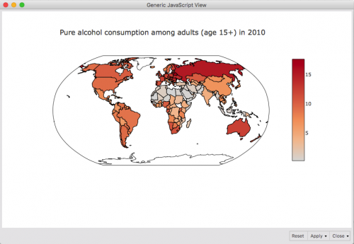
Display theView and enjoy playing with your brand new interactive Plotly choroplet map inside KNIME! Feel also free to gather some colleagues around your screen and show off your new KNIME charting capabilities. 🙂
WORK IN PROGRESS
On a final note, be aware that I didn’t manage to make the SVG rendering part work. This may be due to the fact that there is an error in my rendering code which I couldn’t figure out yet. Will keep trying different ideas as time permits.
CONCLUSIONS
In this step by step tutorial I showed how you can generate advanced visualisation with Plotly.js inside KNIME 3. I hope it was useful and instructive. If you like, feel free to leave a comment below with your thoughts. Till next time!
