Part 3 of KNIME for beginners picks up directly from where Part 2 ended. If you did not cover Part 2 yet, it is recommended that you go back and do it now.
Deleting a Node
Let’s start by deleting the Statistics node from the workflow since we do not need it for the following steps. Right click on the Statistics node and choose X Delete from the pop-up menu.

As you click the command, a red cross appears on top of the Statistics node to indicate it is about to be deleted and a pop-up window asks to confirm the deletion of the node. Just to make sure you are not deleting anything by accident, the message specifies you are deleting 1 node and 2 connections. This is correct because the Statistics node we are deleting is connected to the Table Creator on its input and to the Interactive Table on its output.

Click OK to confirm the deletion. If you feel brave you can also tick the Do not ask again option. If you do so, KNIME will stop asking for confirmation on a deletion. Luckily enough even if you delete a node by mistake you can always restore it by choosing File —> Undo or pressing CTRL-Z (Cmd-Z on a Mac).
This is how the workflow looks like after having deleted the Statistics node.

Adding a Chart Visualization
KNIME comes by default with a number of nodes capable of generating graphical views of data. It is time to add one of them to our simple workflow.
Go to the Node Repository and expand Views, identify the Histogram (interactive) node then drag it to the workflow below the Interactive Table one. Then connect the output port of the Table Creator node to both the input of the Interactive Table node and the input of the Histogram (interactive) node.

You just learned that is possible to connect the output of one node to the inputs of multiple nodes at once. This means that both the Interactive Table node and the Histogram (interactive) node will receive the same exact data from the Table Creator node. The difference however is in the kind of view they will produce out of the same data, a tabular representation and an histogram chart respectively.
Note also that in KNIME you cannot connect the output of multiple nodes to the same input port of a single node. This makes perfectly sense since, would this be possible, the receiving node would not know which input to work with of the many. There are however specialised nodes in KNIME that are designed to work with multiple inputs. These nodes have multiple input ports so the rule of one input and one input only per port still applies.
Execute the workflow to have both the Interactive Table node and the Histogram (interactive) node generate their views. Since we used the Execute command, the views will not be displayed automatically.
Manually Resetting a Workflow
From time to time we may want to re-execute a workflow after having changed, for example, the content of an input file or to “refresh” its output.
Once a workflow has been successfully executed (all nodes are on green) it cannot be re-executed right away unless one or more nodes are reset. As we already know, changing the configuration of a node automatically resets it, so the workflow must be run again to updated the output. If the workflow relies on input from an external file and the content of the file has been updated, KNIME has normally no way to know that this happened. To refresh the output with the new information, we need to manually reset and re-execute the workflow.
While this is not strictly necessary for our simple workflow, let’s still practice on how to reset and re-execute a workflow.
Assuming the workflow has just executed successfully (all nodes are on green) and no changes have been made to it, the execution buttons on the toolbar are all greyed out, indicating there is no need to execute the workflow again.

Now right click on the Interactive Table node in the workflow and choose Reset from the pop-up menu.
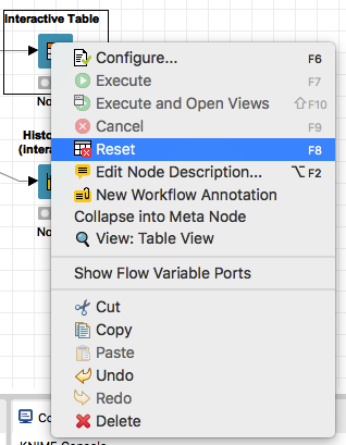
Confirm that you want indeed to reset this node by clicking OK in the confirmation po-up dialog.
As you do so, the node is reset to its “ready to execute” state (yellow traffic light). Note that the Reset command does not reset the configuration of the node, only its state. The configuration is being preserved as indicated by the node turning yellow instead of red.
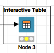
Now the workflow can be re-executed as indicated by the execution buttons being back to active on the tool bar.

Since we have to re-execute the workflow anyway, let’s choose this time the Execute selected nodes and open first view option (rightmost button among the three green ones).
Note that this execution option is only available if any view capable node is selected in the workspace. If you select multiple view capable nodes at once (SHIFT click on each one of them or drag across them with your mouse), all their respective views will be displayed.
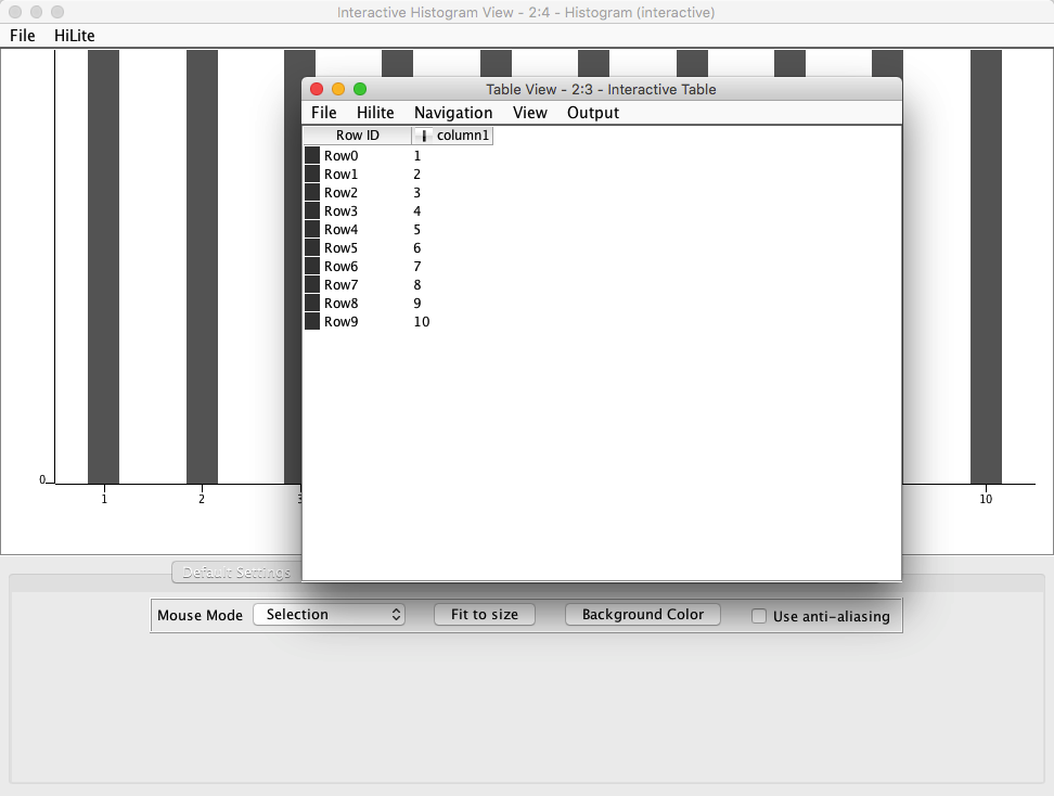
Try to reset the workflow once more, select both the Interactive Table and the Histogram (interactive) nodes, then click on Execute selected nodes and open first view. Note that both the table view and the histogram view open at once.
Highlighting
The two views that are currently on the screen are visually very different, one is tabular and one is graphical, but they represent the exact same data, namely the output of the Table Creator node.
When working with complex data sets displayed across multiple views, it would be handy to have a way to pin-point the same piece of information across all views, regardless of the form the data are displayed. KNIME’s Hilite function provides exactly this capability.
In the Table View, click on the value “2” in Row1 to select it, then choose Hilite —> Hilite Selected from the menu.
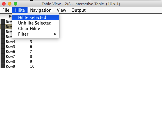
The value you just selected is now highlighted as indicated by the light orange background color.
Take a look at the Interactive Histogram view now. The same value has been automatically highlighted there as well. The highlight is represented by the orange inner filling for the bar corresponding to number “2”.

You can also highlight one or more values inside the Interactive Histogram and have them highlighted in the Table View (so it works both ways).
First select Hilite —> Clear Hilite from the main menu in the Interactive Histogram window. Then drag with your mouse across the bars corresponding to the values “7” and “8”. This has the effect of selecting them both. Choose Hilite —> Hilite Selected from the menu. Both bars have been highlighted with the orange filling.

Now mov to the Table View and check that the same values have been highlighted there as well.

In general all KNIME nodes capable of interactive views will support data highlighting provided there is a relationship between the data in the different views.
Extending KNIME
KNIME is an open-source environment and it benefits from a large community of enthusiasts continuously developing new nodes and extensions to expand its capabilities.
All freely available KNIME extensions are collected and distributed through a number of servers around the world for anyone to download and use inside their workflows. KNIME extensions can be located, downloaded and installed directly from within the KNIME application.
In order to enhance our workflow, we are going to use this possibility to install some additional visualisation nodes based on the open source library JFreeChart.
Choose File —> Install KNIME Extensions… from the main menu.
KNIME will start scanning all known sites that distribute its extensions.
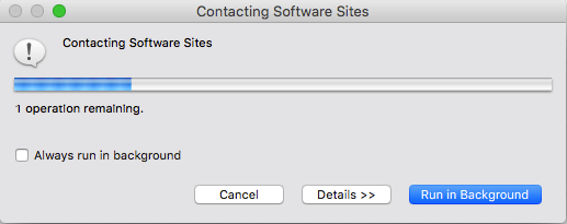
Once this operation is complete, you will be presented with a list of available extensions, grouped under different collections. You can explore which extensions are available by expanding the different collections and checking what is inside.

If you know already the name or partial name of an extension you need, you can type it in the search box (type filter text) at the top. Let’s look for the JFreeChart based extension.
Type “JFreeChart” in the search box. As you type the list of available extensions is being filter to display only those that match. This is the short-list for “JFreeChart”.
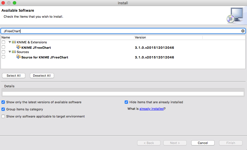
Since KNIME is open-source, most of the extensions come in two “flavours”. The first one is the read-to-use version and the second one is the source-code version. The source-code version is available to advanced users who want to see how the extension works internally or need to modify its behaviour for their own use.
At present time we are not interested in the source-code version, so select, by clicking the corresponding tick-box, the KNIME JFreeChart extensions from the KNIME & Extensions collection. Then click the Next > button.
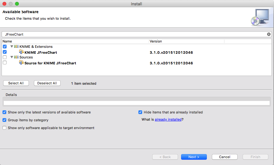
After few moments a new window appears, asking to review the items that are going to be installed. This step is particularly handy if you are installing multiple extensions at once and want to review all of them.
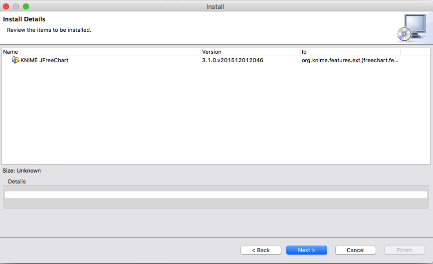
Click Next > to proceed to the next and final step. The final step before any extensions is downloaded and installed is to confirm their Terms of the license agreement. If you are installing multiple extensions at once, you may have to repeat this step for each one of them. Click on “I accept the terms of the license agreement” and then on Finish to start the download and installation process.
![]()
This may require some time as the extension and all its dependent components are downloaded and installed.
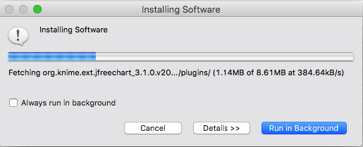
Once the installation is complete, a pop-up message informs you that you need to restart the KNIME Analytics Platform for the changes to take effect. Until you restart KNIME, the new nodes we just installed will not appear in the Node Repository. If you forgot to save your workflow, you can click No and save it, then restart KNIME manually. If you are ok with KNIME restarting automatically, click Yes.

After KNIME has restarted, let’s check that our new JFreeChart nodes are indeed available.
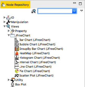
Go inside the Node Repository and check under Views. There you find a new folder named JFreeChart containing a number of new nodes from the extension we just installed. If you don’t happen to know to which group the new nodes have been added to, you can use the filter box to search for “JFreeChart”.
Working with the New Nodes
Now that the JFreeChart nodes have been installed, they can be used in your workflow as any other KNIME node. Note that as you click with the mouse on each node in the Node Repository, the Node Description area shows the description of that node. This is a great way to learn what each node does even before using it!
Let’s now add a Line Chart (JFreeChart) node to our workflow, also connected to the Table Creator node. Note that the Lince Chart node has two inputs. From its description we learn that the topmost input is the data one, while the second one (white connector) is used to assign colours to the various lines in the chart. This is useful when plotting multiple series of data in order to understand which is which.

Right click on the Line Chart node and choose Execute and Open Views from the pop-up menu. A line chart of our data is displayed.

Note that the Line Chart node provides two views in one, as indicated by the two tabs at the top. The first default view is a PNG (raster) rendering of the chart. Its size can be set in the configuration of the node and it can be exported as a PNG file through the File —> Export as command in the menu.
The second view is a vector representation of the same data and, as such, can be scaled at will. It can also be exported as a SVG file through the same menu. Try to drag with the mouse over an area of the JFreeChart View. You will be able to zoom into the selected portion. To zoom out, right click anywhere on the chart and choose Auto Range —> Both axis from the pop-up menu.
JFreeCharts produce a more visually pleasing output than the original KNIME. Unfortunately however they provide only limited interactivity and in particular do not support (yet) highlighting (Hilite).
Conclusion
This concludes Part 3 of this tutorial. Remember to save your workflow for future reference. In Part 4 we will start working with file based inputs and also explore some of KNIME’s advanced data transformation and analysis capabilities.
